
Why Do Letters Still Exist on the Lock Screen Keypad?
A Small Detail, A Big Design Question.

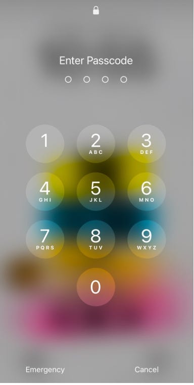
The next time you unlock your iPhone, take a closer look at the numeric keypad. Ever wondered why it includes letters when the passcode is purely numeric?
In 2025, with years of smartphone evolution behind us, do these letters still serve a purpose? Or are they just visual noise? Let’s dive into this intriguing design choice and what it teaches us about product management.
Coherence Across Keypads
One possible reason for retaining letters on the lock screen keypad is to ensure consistency with the keypad used for dialing phone numbers. Having two different keypads could confuse users or disrupt the coherent experience Apple and other companies strive for. A unified design minimizes friction and ensures users don’t need to mentally adjust between tasks like making a call and unlocking their device.
But this raises an important question: Does coherence justify keeping a feature that no longer serves a functional purpose? Or could a more tailored design, like a numeric-only keypad for passcodes, enhance clarity and usability?
Bridging the Gap Between Physical and Digital
When designing products, it’s often useful to transition elements from the physical to the digital world. Users naturally gravitate toward designs that feel familiar. The original letter-number pairing on keypads was essential for dialing vanity phone numbers like 1-800-FLOWERS. By carrying this design into the digital age, companies ensured a smoother transition for users accustomed to physical devices.
However, as interactions become increasingly digital, some legacy features may lose their relevance. In the context of a numeric passcode, the letters add no practical value. They could even create unnecessary visual complexity. This leads us to a key product design question: When does a familiar feature stop aiding usability and start cluttering the experience?
The Case for Simplicity
Modern design principles emphasize simplicity — removing unnecessary elements to reduce cognitive load and streamline the user experience. In the specific context of numeric passcodes, a keypad without letters would focus users on the task at hand: unlocking their device. By eliminating what is essentially visual noise, the design could feel more intentional and less cluttered.
Balancing Familiarity and Innovation
Yet, simplicity isn’t always the right answer. Familiarity plays a crucial role in user adoption and satisfaction. For some users, particularly those who grew up associating numbers with letters, this design might evoke comfort and recognition. Removing the letters could alienate a small but significant group of users.
This dilemma underscores a core challenge in product management: How do you innovate without disregarding the needs of legacy users? How do you strike the right balance between improving usability and maintaining a design’s familiarity?
Lessons for Product Managers
The letters on the lock screen keypad may seem like a trivial detail, but they highlight several important lessons for product managers:
Design for Consistency: Coherence across similar features can reduce user confusion, but it’s worth questioning whether consistency always serves the user experience.
Transition Thoughtfully: Bridging the gap between physical and digital design requires understanding what features help users adapt versus what elements no longer serve a purpose.
Embrace Testing: Don’t make assumptions about what users want. Test potential changes, gather feedback, and let data guide your decisions.
Simplify with Care: Removing features can improve usability, but it’s essential to respect legacy users and consider their needs in the process.
Conclusion
The iPhone lock screen keypad is a perfect example of how even small design choices can spark larger conversations about product management. It challenges us to think critically about balancing simplicity, familiarity, and innovation.
Next time you unlock your phone, take a moment to reflect: What other legacy features in your favorite products are hiding in plain sight? Do they enhance the experience, or are they ready for a redesign?
I’d love to hear your thoughts! Would you remove the letters, or do they deserve to stay? Share your perspective in the comments or forward this article to a fellow product geek who loves debating design quirks.